Warm Neutrals in Interior Design: Why Grey Is Being Replaced by Softer, Timeless Tones
Disclosure: This post may contain recommended products from various brands and retailers. Some links may be affiliate links, meaning I may earn a small commission at no extra cost to you if you make a purchase. I only share pieces I truly love and believe will bring warmth and beauty into your home. These commissions help fund this blog, allowing me to continue sharing expert interior design recommendations, insights, and inspiration. Thank you for your support!
Warm neutrals are redefining interior design as homeowners move away from the cool grey palettes that dominated the past decade. Once considered a safe and modern choice, grey is now often perceived as flat, cold, or disconnected from how people want their homes to feel. In its place, warmer neutrals are gaining momentum, offering depth, flexibility, and a stronger emotional connection to space.
This shift is not about rejecting neutrality altogether. Instead, it reflects a more nuanced understanding of colour, light, and materiality. Warm neutrals support longevity, adaptability, and comfort, making them especially relevant as homeowners plan thoughtful updates rather than frequent renovations.
Understanding the rise and decline of grey interiors
Grey became popular because it offered clarity and versatility. It paired easily with white, black, and stainless steel, aligning well with open concept layouts and modern finishes. For many years, it served as a neutral backdrop that felt current and safe.
Over time, however, its limitations became more apparent. Cool greys can feel stark in low natural light, flat against warm materials, and emotionally distant in spaces meant for rest and connection. In colder climates, these effects are often amplified, making interiors feel uninviting for much of the year.
As design priorities have shifted toward comfort and wellbeing, the appeal of grey has softened. Homeowners are increasingly aware of how colour influences mood, leading to a broader exploration of warmer alternatives.
What defines a warm neutral palette
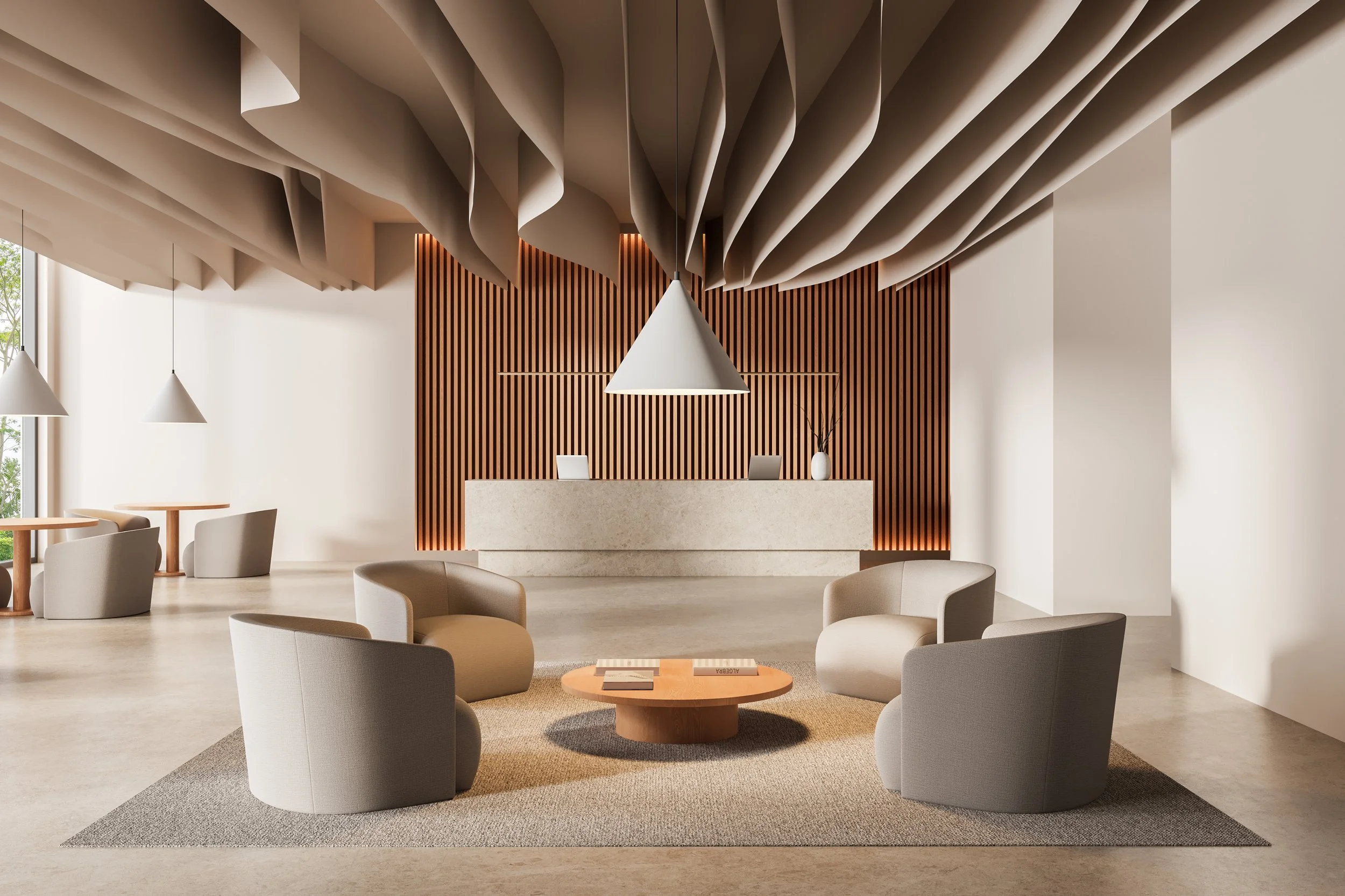
Warm neutrals are colours that sit close to the centre of the spectrum but carry subtle warmth through undertones. They are not bold or highly saturated, yet they offer more depth than cool greys or stark whites.
Common warm neutrals include soft whites with cream or beige undertones, greige that leans warm rather than blue, taupe, sand, mushroom, stone, and light clay tones. These colours often draw inspiration from natural materials and landscapes.
The defining quality of warm neutrals is their ability to adapt. They respond well to changing light, complement a wide range of materials, and feel grounded rather than stark.
Why warm neutrals feel more timeless
Timeless interiors are rarely built around extremes. Warm neutrals succeed because they sit comfortably between light and dark, modern and traditional.
Unlike cool greys, which can quickly date when trends shift, warm neutrals have a long design history. Many are rooted in classical architecture, natural materials, and regional building traditions. This heritage gives them a sense of permanence.
Warm neutrals also age well. As materials develop patina and furnishings evolve, these colours continue to feel cohesive rather than restrictive.
The role of undertones in getting it right
One of the most common mistakes when transitioning away from grey is underestimating undertones. Two colours may appear similar on a swatch but behave very differently once applied.
Warm neutrals often contain subtle yellow, red, or brown undertones. These undertones interact with natural light, artificial lighting, and surrounding materials. A colour that feels balanced in one space may appear muddy or overly warm in another.
Testing samples in different lighting conditions is essential. Observing how a colour shifts throughout the day helps ensure it supports the intended atmosphere rather than working against it.
How warm neutrals enhance natural materials
Warm neutrals pair particularly well with natural materials, which are increasingly central to contemporary interiors. Wood, stone, linen, leather, and clay all benefit from a warmer backdrop that allows their texture and variation to stand out.
Where cool grey can dull or flatten these materials, warm neutrals enhance their richness. Wood appears deeper, stone feels more organic, and textiles gain softness.
This synergy supports a more cohesive and layered interior, where colour and material work together rather than competing.
Applying warm neutrals room by room
Warm neutrals can be adapted to every area of the home, but their application should respond to function and light.
In living spaces, warmer tones create a sense of ease and sociability. They work well as wall colours, upholstery bases, and larger furniture pieces.
Bedrooms benefit from the calming quality of warm neutrals, particularly those with soft brown or taupe undertones. These colours support rest without feeling heavy.
Kitchens and bathrooms often require careful balance. Warm neutrals can soften hard surfaces and create a more welcoming feel, especially when paired with natural stone or wood cabinetry.
Warm neutrals in modern and traditional homes
One of the strengths of warm neutrals is their versatility across architectural styles. In modern homes, they soften clean lines and reduce visual severity. In traditional homes, they provide continuity and quiet elegance.
Warm neutrals also act as a bridge in transitional interiors, allowing contemporary and classic elements to coexist comfortably.
This adaptability makes them an effective choice for renovations where not all elements are being updated at once.
Moving beyond flat colour through layering
Warm neutrals are most effective when layered rather than applied uniformly. Variation in tone, texture, and finish creates depth and visual interest without relying on contrast.
This layering can be achieved through subtle shifts in wall colour, trim, upholstery, and textiles. Matte finishes often enhance warmth, while natural textures prevent the palette from feeling monotone.
Lighting also plays a critical role. Warm neutrals respond well to soft, layered lighting, reinforcing their depth and adaptability.
Why this shift reflects deeper lifestyle changes
The move toward warm neutrals mirrors broader changes in how people view their homes. Interiors are increasingly expected to support emotional wellbeing, not just visual appeal.
Warm colours feel more human and forgiving. They create environments that are lived in rather than styled, aligning with the desire for homes that feel restorative and personal.
This shift also reflects a move away from trend driven design toward choices that prioritise longevity and comfort.
Avoiding common mistakes when transitioning from grey
Replacing grey does not mean simply choosing beige. Without attention to undertones and context, warm neutrals can feel dated or heavy.
Balance is key. Warm neutrals benefit from contrast through texture, proportion, and occasional darker accents. They also require thoughtful lighting to avoid appearing dull.
Retaining some cooler elements can create balance, particularly in homes with limited natural light or strong architectural features.
The future of neutral interiors
Warm neutrals are likely to remain central to interior design as the focus on longevity and wellbeing continues. Rather than cycling through extremes, neutral palettes are becoming more nuanced and context driven.
Future interpretations may explore deeper earth tones, mineral inspired hues, and subtle colour variation that reflects regional light and landscape.
What will remain consistent is the preference for neutrals that feel grounded, adaptable, and emotionally supportive.
Conclusion
The shift from cool grey to warm neutrals marks an important evolution in interior design. It reflects a deeper understanding of how colour influences comfort, longevity, and daily experience.
Warm neutrals offer flexibility, timelessness, and a stronger connection to natural materials and light. When chosen thoughtfully, they create interiors that feel current without being trend bound.
For homeowners planning updates or full renovations, warm neutrals provide a foundation that supports both present needs and long term living.
Read More…
“I believe that if you are true to expressing yourself, coupled with the right amount of discipline and routine, your space can reflect your personality, and you can turn your home into your haven.”

The Complete Client Experience Template System
Discover a comprehensive, fully customisable suite of templates designed to guide you through every phase of your interior design projects.
From onboarding to approvals, proposals to presentations, this system supports a smoother, more polished process at every step.
Whether you're just starting out or refining your workflow, these templates help you lead with clarity, save time, and elevate your client experience from day one.