How to Use White in Interior Design
Disclosure: This post may contain recommended products from various brands and retailers. Some links may be affiliate links, meaning I may earn a small commission at no extra cost to you if you make a purchase. I only share pieces I truly love and believe will bring warmth and beauty into your home. These commissions help fund this blog, allowing me to continue sharing expert interior design recommendations, insights, and inspiration. Thank you for your support!
White interiors never go out of style. They are calm, versatile, and timeless. Yet designing with white is far more nuanced than simply choosing a pot of paint and rolling it onto your walls. When used well, white creates a serene backdrop that elevates every detail in a room. Used poorly, it can feel cold, harsh, or sterile.
This guide will show you how to decorate with white intentionally, layering tones, textures, and contrasts to achieve interiors that feel sophisticated, inviting, and full of depth. From choosing the right undertones to balancing with light, you will learn how to make white work for your home rather than against it.
Why White is a Design Classic
White has been a staple in interior design for centuries. From classical architecture with its marble facades to minimalist Scandinavian homes, white continues to evolve without losing relevance. Its appeal lies in versatility:
Creates space: White visually enlarges a room, making it appear bigger and brighter.
Highlights details: It allows other features like artwork, furniture, or architectural trim to stand out.
Adapts easily: White suits almost any design style, whether modern, rustic, coastal, or traditional.
However, these strengths can quickly become weaknesses if not handled with care. Too much stark white can feel empty, while an unbalanced palette may come across as bland. The key is to use white thoughtfully.
Step 1: Choose the Right White
Not all whites are created equal. In fact, paint companies produce hundreds of variations because undertone dramatically changes how white feels in a room.
Warm whites
Contain undertones of cream, ivory, or soft yellow.
Perfect for north-facing rooms where natural light is cooler.
Create a cosy, welcoming effect.
Examples: Farrow & Ball Pointing, Benjamin Moore White Dove.
Cool whites
Include undertones of blue, green, or grey.
Work well in bright, sunlit south-facing spaces where warmth is abundant.
Deliver a crisp, airy finish that feels modern.
Examples: Benjamin Moore Chantilly Lace, Dulux White Mist.
True whites
Neutral with little to no undertone.
Clean and modern, ideal for contemporary interiors.
Can feel stark if not softened with texture or contrasting accents.
Examples: Sherwin-Williams Extra White, Little Greene Loft White.
Pro Tip: Always test paint samples in both daylight and evening light. White reflects whatever light it receives, so the same shade can shift from warm and inviting during the day to cold and flat under artificial bulbs.
Related reading: Best Paint Colours to Make a Room Look Bigger.
Step 2: Vary Your Whites
One of the biggest mistakes is painting everything in a single white. This flattens a room and makes it look unfinished. Instead, layer slightly different whites across surfaces for a subtle, sophisticated effect.
Walls: Choose a soft white with a gentle undertone.
Trim and mouldings: Opt for a brighter, cleaner white to highlight architectural details.
Ceiling: Use a muted or lighter white to create contrast and lift the eye upward.
For example, Benjamin Moore Simply White on walls, Chantilly Lace on trim, and Oxford White on ceilings deliver a polished, layered look.
This principle mirrors how natural materials work together. Just as combining oak and walnut adds richness in furniture, layering whites prevents monotony.
Further inspiration: Can You Mix Woods in Interior Design?.
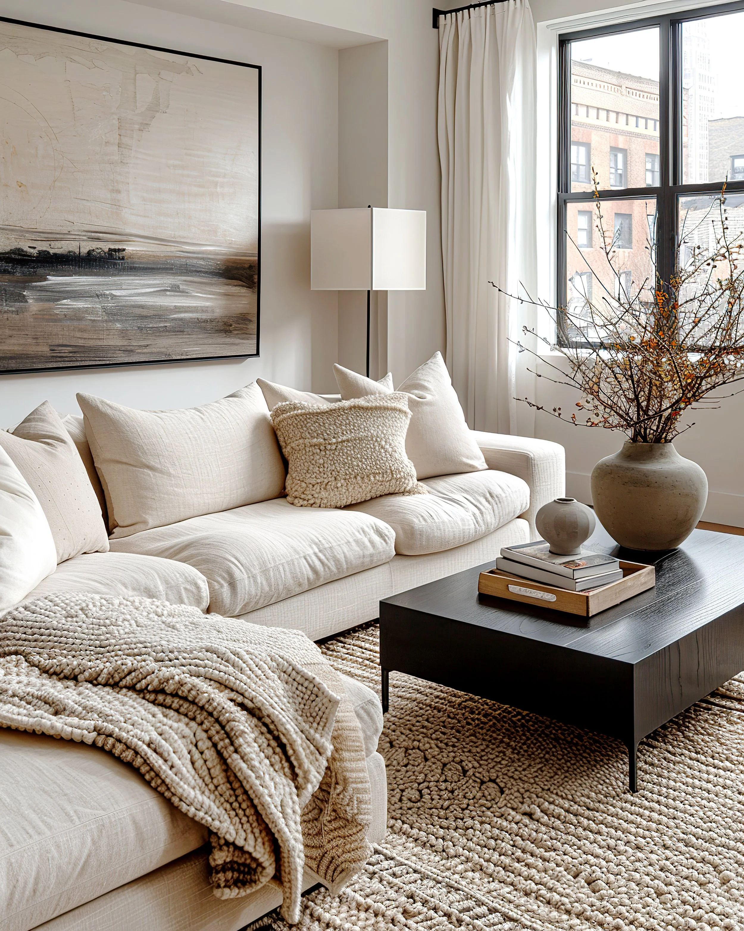
Step 3: Bring in Texture
White interiors depend on texture to feel warm and welcoming. Without it, even the perfect shade of paint risks looking like a blank canvas. By layering tactile materials, you introduce dimension and comfort.
Ideas for layering texture in white spaces:
Textiles: Linen curtains, boucle chairs, cotton throws, velvet cushions.
Floors: Woven sisal rugs or textured wool carpets.
Finishes: High-gloss cabinets next to matte plaster walls.
Natural accents: Exposed stone, distressed wood, or rattan baskets.
Even white-on-white pairings—like pairing matte subway tile with glossy cabinetry—create visual interest while maintaining a cohesive palette.
Styling tip: Accessories are where you can inject personality. White interiors offer the perfect backdrop for staging objects. See How To Stage your Coffee Table for ways to style accents within a restrained palette.
Step 4: Add Contrast for Balance
All-white rooms run the risk of looking washed out. Introducing darker or contrasting accents grounds the design and provides visual definition.
Hardware: Black handles or brass fixtures add striking contrast.
Furniture: Deep wood tables or charcoal sofas anchor the scheme.
Lighting: A sculptural pendant or dark lamp base creates a focal point.
Artwork: Bold frames or colourful canvases stand out beautifully against white walls.
The goal is not to overwhelm but to balance. Think of white as the stage and darker elements as the actors that bring the performance to life.
Step 5: Pay Attention to Light
White is highly reflective, meaning its character changes with the light in a room. A white that feels warm in the morning may look clinical under cool LED lighting at night.
How to get it right:
Test samples on different walls to see how they react at various times of day.
Choose warm-toned bulbs for a cosy feel, or daylight bulbs for crisp clarity.
In low-light rooms, avoid cooler whites that may feel gloomy.
Lighting is not just functional but part of the design. The interplay between paint, fixtures, and bulbs determines the final effect.
Expanding White Beyond Paint
While most people think of paint first, white can be incorporated in many other ways:
Furniture: White sofas, chairs, or cabinetry act as anchors.
Floors: Whitewashed wood or pale stone adds brightness.
Accessories: White ceramics, lamps, and frames keep the palette cohesive.
Kitchens and bathrooms: White tiles or countertops create a timeless base.
Layering these elements ensures white feels intentional rather than accidental.
Common Mistakes When Decorating with White
Choosing the wrong undertone – A cool white in a dark room can feel icy.
Overusing one shade – Creates a flat, lifeless effect.
Ignoring texture – Results in a sterile, clinical look.
Neglecting lighting – The same white can look drastically different under various bulbs.
Skipping balance – Without contrast, the room lacks definition.
Styling White for Different Design Styles
Scandinavian: Pair white walls with natural wood, sheepskin rugs, and clean lines.
Coastal: Use soft whites with sandy beige, rattan, and navy accents.
Modern farmhouse: Mix creamy whites with rustic wood and black metal fixtures.
Minimalist: Stick to pure whites but emphasise sleek furniture and strong silhouettes.
Traditional: Choose warm whites and layer with rich fabrics and classic mouldings.
White in Different Rooms
Living rooms: Use soft whites with layered textures for comfort.
Bedrooms: Warm whites paired with linen bedding create calm retreats.
Kitchens: Crisp whites on cabinetry feel fresh but balance with darker counters.
Bathrooms: Cool whites with glossy tiles create a spa-like atmosphere.
Hallways: Bright whites make narrow spaces feel wider.
Final Thoughts
White is one of the most versatile colours in interior design, but it requires careful handling. The right undertones, layering of shades, texture, and contrasts transform white from flat to fabulous. Far from sterile, white interiors can be warm, sophisticated, and quietly powerful.
By understanding how light affects it, how texture enriches it, and how contrast defines it, you can design spaces that feel timeless, intentional, and beautifully lived in.
“I believe that if you are true to expressing yourself, coupled with the right amount of discipline and routine, your space can reflect your personality, and you can turn your home into your haven.”

The Complete Client Experience Template System
Discover a comprehensive, fully customisable suite of templates designed to guide you through every phase of your interior design projects.
From onboarding to approvals, proposals to presentations, this system supports a smoother, more polished process at every step.
Whether you're just starting out or refining your workflow, these templates help you lead with clarity, save time, and elevate your client experience from day one.